Why your Restaurant’s Website Must Be Mobile-Friendly.

The way how people find local restaurants has completely changed in recent years. Nowadays, restaurants are the most searched industry on phones. Statistics show that 88% of adults use restaurant technology to look up restaurant locations, directions and hours. 70% look at menus and 54% order takeout or delivery directly from a restaurant’s website. For restaurants, that means making sure your website is responsive, in other words it should look good on any device: phone, tablet, laptop or desktop.
In fact, majority of independent restaurants don’t have mobile-friendly websites. This is not only a big inconvenience for their clients, but results in a lost business opportunity. As recent study shows, 62% of consumers are less likely to choose a restaurant if they can’t read the menu on a mobile device. So, what happens when smartphone users (especially Millennials) hit your restaurant website, and it isn’t mobile responsive? Most likely, they leave.
Moreover, starting April 21, 2015, Google updated its search algorithm so that comparable mobile sites will rank higher than non-mobile friendly sites in mobile search results. What does that mean for you exactly? If your current website isn’t mobile friendly, it will drop in Google’s mobile search results and you’ll be sending customers away to your competitors.
You can easily determine whether your website is currently being deemed “mobile-friendly” by Google:
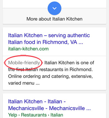
1. Try searching your restaurant on Google using your smartphone and check if you see a ‘mobile-friendly’ tag. If you see this tag, you have nothing to worry about.

2. Run your site through Google’s Mobile-Friendly Test by simply entering your url in the provided box.
If you do not pass the mobile test, you need to start thinking about updating your website soon. As the world moves to mobile, it is critical that restaurant websites are able to keep up. A survey shows, 28% of mobile web users rarely or never use the desktop anymore. And it’s about 25 million people in the US alone.